If your aesthetic clinic website looks nice but bookings are slow, the issue is usually not your brand but how your pages guide visitors. When you optimize your aesthetic clinic website for conversions, you turn casual browsing into real inquiries and appointments.
At Skinspire, we specialize in aesthetic clinic web design and conversion optimization. Skinspire has supported clinics across multiple cities by redesigning websites, optimizing treatment pages, and improving conversion pathways based on real user behavior. Our recommendations are grounded in performance data, heatmaps, scroll patterns, call-to-action engagement, and booking flow analytics, so every update is tied directly to real patient actions.
We often see common mistakes and quick wins across many clinics. This guide shows what makes patients act, how to build a conversion-focused homepage and treatment pages, and how trust, speed, and mobile tweaks can increase bookings on your cosmetic clinic website.
If you want expert eyes on your own site while you read, you can request a website conversion audit from Skinspire so we can highlight specific changes that can boost your bookings.
If you want a fast, expert assessment, you can request a complimentary Conversion Review from Skinspire. We’ll identify friction points, missed trust signals, and layout issues holding back bookings, and outline exactly what to fix first.
What Makes Patients Take Action on Your Website
If you are wondering how to improve aesthetic website conversions, it starts with understanding the main drivers that push patients to schedule a consultation or booking.
The Key Drivers of Action
There are a few major elements that push someone from “just looking” to “ready to contact you.” Patients need to understand your offer, feel safe with your team, and see a clear path to move forward. When any of these elements is missing, your conversion rate drops even if your clinic is excellent offline.
- Clear messaging. Patients need to understand what you offer within a few seconds. Your hero section should say who you serve and what outcome you help them achieve, not just “Welcome to XYZ Clinic.”
- Friction-free path. Visitors should always see a clear next step, such as “Book Consultation” or “View Treatments.” Every page should lead them to a simple action, not leave them stuck.
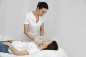
- Strong trust and proof. Aesthetic patients can be nervous. They want to see proof first. Before-and-after photos, real reviews, and medical credentials help them feel safe.
- Comfortable user experience. Fast-loading pages, clean layout, and mobile-friendly design reduce stress. When a site is slow or cluttered, people often leave before they ever see your treatments.
These elements work together to form practical website conversion tips for clinics. When you strengthen them, you make it easier for patients to say yes to a consultation. Over time, this leads to more inquiries without always needing more traffic.
Designing A Conversion-Focused Homepage
Your homepage is your most important conversion asset. It often creates the first impression and decides whether visitors explore further or bounce away. Think of it as a guided tour that answers “Who are you?”, “What do you offer?” and “How do I start?” in a smooth order.
A well-planned homepage acts like a friendly staff member who welcomes visitors and shows them around. It highlights your core treatments, shows proof of your results, and points clearly to the next step. When you design it this way, you support both user experience and conversion rate optimization for medical websites.
Hero Section That Does The Heavy Lifting
Your hero is the top section that users see first, so it carries a lot of responsibility. It should quickly tell visitors what you do, who you serve, and what results they can expect. It should also offer a clear way to move forward, even for people who are only mildly interested. A strong hero for an aesthetic clinic usually includes:
- Clear headline: Example: “Natural-looking aesthetic treatments for busy professionals in [City].”
- Short supporting text: One or two lines that explain your approach or specialty.
- Primary call to action (CTA): Example: “Book a consultation” or “Request a treatment plan.”
- Secondary CTA: For visitors who are not ready yet, offer a softer action such as “View treatments” or “Browse before and after photos.”
- Reassurance elements: Small trust points near the hero, such as “Board-certified team,” “Hundreds of 5-star reviews,” or simple icons for safety, privacy, and experience.
With these parts in place, visitors do not have to guess what your clinic is about or what they should do next. They see a direct path, supported by small signals of trust. This simple structure can already increase aesthetic clinic leads from your homepage.
Homepage Sections That Guide The Journey
Below the hero, your homepage should guide visitors down a clear path. Each section should have a purpose, such as showing your main treatments, building trust, or explaining your process. You can also include a simple micro-conversion, such as an “Am I a candidate?” quiz or a short guide download, for visitors who are not ready to book yet.
A simple wireframe helps teams visualize how each part of the homepage should behave. Skinspire recommends structuring the page in a top-to-bottom flow: hero → key treatments → trust elements → process → final CTA. This consistent structure prevents clutter, reduces bounce rates, and encourages deeper exploration.
When these sections are arranged in a logical order, visitors feel guided rather than being left to explore a maze.
- Snapshot of your key treatments. Short cards with links to your main treatment pages, not long blocks of text.
- Why do patients choose you? Three to five short points about your approach, comfort, staff, or technology.
- Before and after preview. A small gallery section that links to your full gallery page.
- Social proof. Star ratings, short review quotes, or logos of associations.
- Simple “How it works” steps. For example: “1. Schedule consult, 2. Personalized plan, 3. Treatment and follow-up.”
- Final CTA strip. A repeated call to action at the bottom (for patients who scroll all the way).
This type of layout supports both user experience and aesthetic website optimization. If you are planning a full redesign, you can link a section of this page to your Aesthetic Clinic Web Design resource to give visitors a deeper view of your design work. When done well, each section nudges visitors a little closer to booking an appointment.
If you want support mapping or redesigning your homepage around these conversion steps, Skinspire can help you turn your existing layout into a higher-performing version without losing your brand feel.
Optimizing Our Service And Treatment Pages
Once the homepage convinces someone to explore, your treatment pages need to answer every key question that sits between curiosity and booking. These pages should feel specific, reassuring, and easy to scan.
When your treatment pages follow a consistent layout, patients trust your clinic more and feel less confused. They can compare options side by side and quickly see which treatment might fit them. This is a direct way to increase aesthetic clinic leads without sounding pushy.
Here is a simple structure you can use for most treatments:
- Clear treatment overview. One short paragraph that explains what the treatment is and what it does, in plain language.
- Who it is for. A bullet list of common concerns or patient types (for example, “fine lines,” “acne scars,” “loss of volume”).
- Expected results and benefits. Simple, realistic outcomes such as “smoother skin texture,” “more defined jawline,” with an approximate timeline (for example, “results appear in 2–4 weeks”).
- Before and after photos. A small gallery that shows this specific treatment, not random images mixed together.
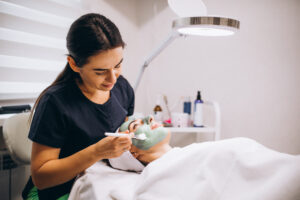
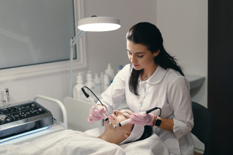
- Safety and credentials. Short, clear notes about who performs the treatment, what training they have, and basic safety information.
- Frequently asked questions. A few focused FAQs about pain level, downtime, number of sessions, and cost range.
- Strong, repeated CTA. Use the same primary CTA across your treatment pages, such as “Book a consultation” or “Check if this treatment is right for you.”
To improve rankings and conversions simultaneously, integrate natural keyword phrasing, such as “Botox in [City]” or “Laser resurfacing treatment for [Concern]” within headings and short intro sections. This helps Google understand the page while keeping the wording conversational and patient-friendly.
This layout helps increase aesthetic clinic leads by giving patients everything they need to feel confident and ready to reach out.
If you want a faster path, Skinspire can review and outline your key treatment pages for you, so your clinic has clear, consistent templates that are built to convert.
Trust and Proof Elements That Boost Conversions
When trust is visible on your site, visitors feel safer and more open to booking. They see that others have had good experiences and that your team is qualified. These details become strong support for all your CTAs and offers.
Use Before-and-after Photos Wisely
Before-and-after photos are some of the most powerful tools on your site. They give patients a real sense of the results you can deliver. To be effective, they need to be clear, organized, and easy to understand.
- Group photos by treatment, so visitors see clear, relevant examples.
- Avoid overwhelming people with huge grids. Start with 4 to 8 strong photos per page.
- Add short captions that describe the case in simple terms, such as “Cheek filler for added volume, 2 sessions.”
Good before-and-after photos make your promises feel real instead of abstract. They show the type of change that is possible without overhyping. This type of visual proof is especially important in aesthetic website optimization, where results are everything.
Show Real Reviews and Stories
Reviews and patient stories help visitors feel less alone in their fears and questions. Skinspire recommends placing short review quotes directly beside CTAs, not only in dedicated testimonial sections. When proof appears at key decision points, like near the booking button, conversion rates typically rise because visitors feel emotionally reassured at the exact moment they’re deciding. When they read about others who had good experiences, they feel more comfortable reaching out. These stories work best when they are short, believable, and placed near key decision points.
- Include short review quotes near your CTAs and treatment sections.
- Use a dedicated testimonials or “Patient Stories” page linked from the homepage.
- If you have hundreds of reviews, highlight a simple stat such as “Over 250 5-star reviews.”
Well-placed reviews and stories act like a friend’s recommendation. They lower the emotional barrier to booking a consultation. Over time, this steady proof supports higher conversion rates across all traffic sources.
Highlight Your Credentials
Credentials and qualifications help visitors see that your team is skilled and trustworthy. Many patients do not know what each certification means, so simple explanations help. The goal is to show that you are serious about training and safety without sounding cold.
- Show photos and titles for lead providers (for example, medical director, aesthetic nurse).
- List key certifications and memberships.
- Keep language clear so non-medical visitors understand what each credential means.
Trust and proof elements turn your claims into something patients can see and believe. With the right photos, reviews, and credentials, your site feels honest and professional instead of salesy. This deeper trust makes every click on your Book or Contact button more likely.
Website Speed and Mobile UX
When pages load quickly and forms are easy to use, visitors stay longer and explore more treatments. They are also more likely to finish booking instead of giving up halfway. Investing in speed and mobile UX is one of the most direct ways to boost conversion rate without changing your offers.
Why Speed Matters
Speed is one of the first silent tests your website must pass. Slow pages frustrate visitors and reduce trust, especially when they are researching something as personal as aesthetic care. A faster site feels more professional and more respectful of your visitors’ time.
A few simple ideas:
- Compress large images, especially before-and-after photos.
- Avoid auto-play videos in the hero if they slow the page.
- Keep scripts and plug-ins to what you truly need.
You can also improve conversion speed by removing unused CSS libraries, reducing unnecessary third-party scripts, and limiting large hero images. Skinspire’s audits often find that simplifying code and image weight can increase conversion rates by improving first-input delay and time-to-interactive.
A faster site helps more people reach your key content before losing patience. Search engines also favor faster sites, which helps with visibility over time. This directly supports both user experience and conversion rate optimization for medical practices.
Mobile Conversion Basics
On mobile, people scroll quickly and have limited attention. They might be on a break, on the couch, or in transit, and any friction can make them close the tab. A good mobile experience keeps key information and CTAs easy to reach with minimal effort.
On mobile, visitors scroll fast, and their attention is thin. Help them by:
- Using large, tap-friendly buttons for CTAs.
- Keeping forms short. Ask only for the key details needed to contact the patient.
- Adding a simple click-to-call button, especially in the header or sticky bar.
- Making sure text is easy to read without zooming.
When mobile visitors can read, scroll, and act without hassle, they feel more positive about your clinic. This ease often turns a quick look into a booked consultation. For many clinics, better mobile UX alone can unlock a meaningful lift in conversions.
Skinspire’s Critical Territory Protection Guarantee
Beyond your website itself, who you choose as a marketing partner also affects your long-term results and peace of mind. Many medspa owners worry that a marketing partner will work with a direct competitor down the street and use the same strategies against them.
Your website and conversion work feel less valuable if the same team also powers your closest rival. Skinspire’s Critical Territory Protection Guarantee is our way of addressing this concern from the start.
With this guarantee, we commit to protecting your local area by not actively building the same type of aesthetic clinic website and conversion system for another medspa within a set distance of your location.
The protected distance is based on the package you choose and your city’s population density, so busier areas receive protection that fits the local market. The goal is to give you confidence that our work on your site is focused on your clinic, not your nearest competitor.
For you, this means your investment in conversion optimization and design is supported by real territory protection. You can lean into long-term growth knowing Skinspire is not selling the same strategy to the medspa next door.
This type of exclusivity is especially important in aesthetic and medspa markets, where local competition and trust play a huge role in bookings.
Turn Your Website Into A Booking Engine
When you optimize an aesthetic clinic website for conversions, you are not just improving the look of your pages. You are shaping a clear, low-stress path from first impression to booked appointment. Every change you make to messaging, layout, trust, and speed works together to support that path.
To recap:
- Use your homepage hero to explain who you serve, what results you deliver, and what to do next.
- Structure your homepage with treatments, trust, and a simple “How it works” section.
- Build treatment pages that answer every key question and end with a clear CTA.
- Use targeted before-and-after photos, reviews, and credentials to build trust.
- Improve speed and mobile usability so visitors can take action without friction.
If you are unsure where to start or feel too close to your own website, a fresh set of expert eyes can help. A focused conversion audit will reveal which parts of your layout, content, and UX are blocking patients from booking. By acting on these insights, you turn your site into a steady source of qualified leads for your clinic.
Your website can do more than share information about your clinic. With thoughtful changes based on patient behavior and clear design, it can actively support your growth. When you are ready, requesting a conversion audit with Skinspire is a smart next step to turn insight into more bookings.
If you want help identifying which parts of your website hold back conversions, Skinspire can provide a personalized report showing exactly where patients drop off and what improvements will create the biggest immediate lift.
FAQs
How do I increase conversions on my aesthetic clinic website?
You can increase conversions by making your message clear, improving the layout of your homepage and treatment page, adding strong trust elements, and fixing speed or mobile issues. Focus on a simple path from the hero section to booking, with repeated CTAs and proof such as reviews and before-and-after photos. When these basics work together, more visitors will feel ready to contact your clinic.
Where should CTAs be placed on an aesthetic clinic website?
Place your primary CTA above the fold in the hero so visitors see it right away, then repeat it after key sections such as treatment previews, testimonials, and “How it works.” Every important page, especially treatment pages, should end with a clear CTA like “Book a consultation” or “Request a treatment plan.” This repetition keeps the next step obvious without feeling pushy.
Does mobile design impact conversions for aesthetic clinics?
Yes, mobile design has a major impact on aesthetic website conversions because many patients first visit on their phones. If your pages are slow, hard to read, or difficult to tap, they will leave instead of booking or calling. A mobile-friendly layout with large buttons, short forms, and click-to-call options can significantly improve your conversion rate.
What should my aesthetic clinic homepage include to convert more patients?
Your homepage should include a clear hero section with your main promise, strong CTAs, a snapshot of key treatments, and visible trust elements like reviews and before-and-after photos. It should also show a simple “How it works” process so visitors understand the steps from consultation to treatment. When these pieces are in place, your homepage guides patients smoothly toward booking.
How can treatment pages help improve aesthetic website conversions?
Well-structured treatment pages answer the most common questions about who the treatment is for, what results to expect, and what the process looks like. They also include targeted before-and-after photos, safety information, and a clear CTA to book a consultation. This level of detail builds confidence and reduces the hesitation that often stops visitors from reaching out.
Why are reviews and before-and-after photos important for aesthetic clinic websites?
Reviews and before-and-after photos act as proof that your aesthetic clinic can deliver safe, real results. They help visitors feel less nervous about choosing a provider, especially for treatments that affect appearance. When this proof is placed near CTAs and key content, it builds trust and drives more completed bookings.
What is a website conversion audit for an aesthetic clinic?
A website conversion audit is a focused review of your pages, messaging, layout, and UX to find what stops visitors from booking. For aesthetic clinics, it looks closely at your hero, treatment pages, trust elements, speed, and mobile experience. A Skinspire conversion audit then turns these findings into clear action steps to help your website generate more qualified leads and appointments.